Project
Universal Studios Parks & Resorts
The redesigned Universal Studios website was aimed at enhancing user engagement and streamlining the overall experience. The new design integrates improved functionality with a fresh, modern look.

UX Research

UX Design

Performance

Link to the presentation.
Before We Begin
Defining The Scope
Reimagining the Universal Studios website to be accessible and user-friendly for new visitors, individuals with disabilities, and experienced users alike.
Phase 1
The Situation
Balancing brand identity, user experience, and technical integration challenges.
The redesign  focused on simplifying user interactions and enhancing visual appeal. We prioritized a clean, intuitive layout, using engaging imagery and  concise text to guide users seamlessly through the site.
Another thing that is very important is the art of surprise and delight. We want to make the experience fun, pleasant and memorable. Adding in  little touches such as pictures of a Minion or maybe a Simpson character adds to the fun nature that is Universal Studio Parks and Resorts.
Previous Work
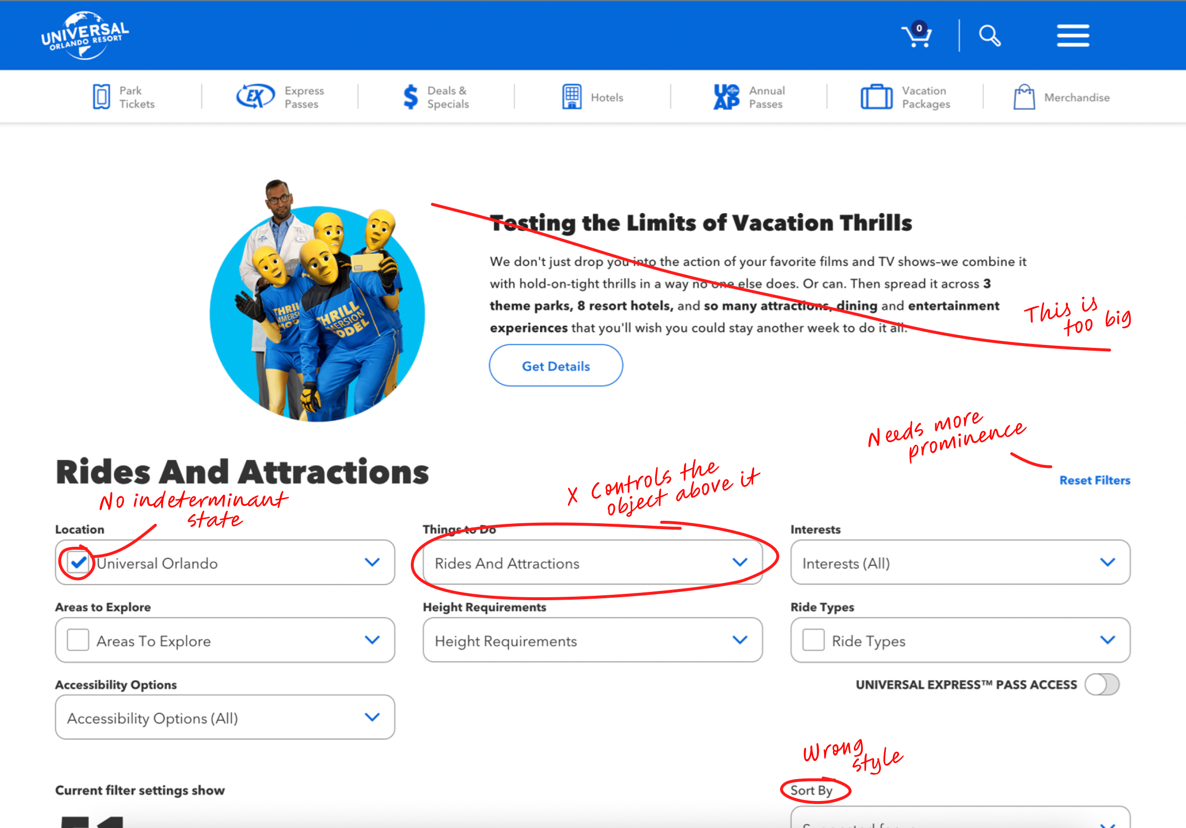
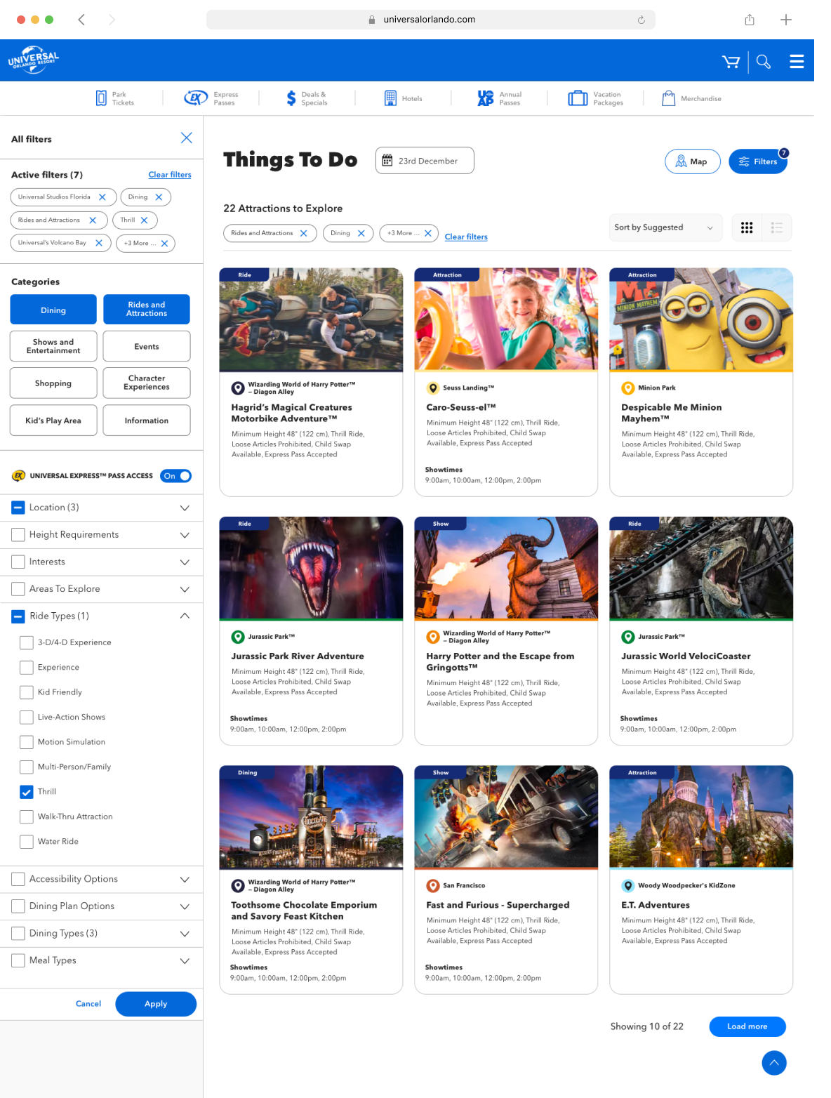
UX Option—Active Filters
Active Filters (8)
Clear Filters
Universal Studios Florida
Dining
Rides and Attractions
Thrill
Universal’s Volcano Bay
+3 more...
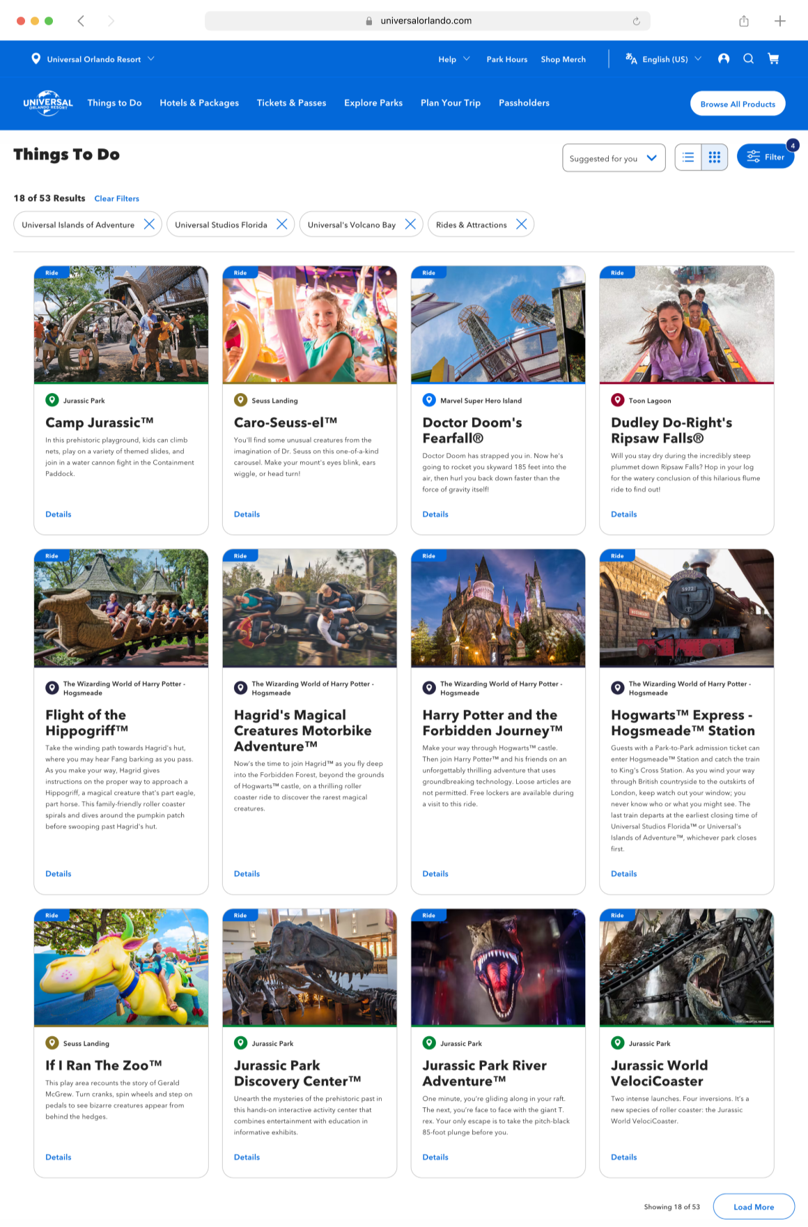
UX Option—New Categories
Phase 1
Resulting In Better Overall Hierarchy
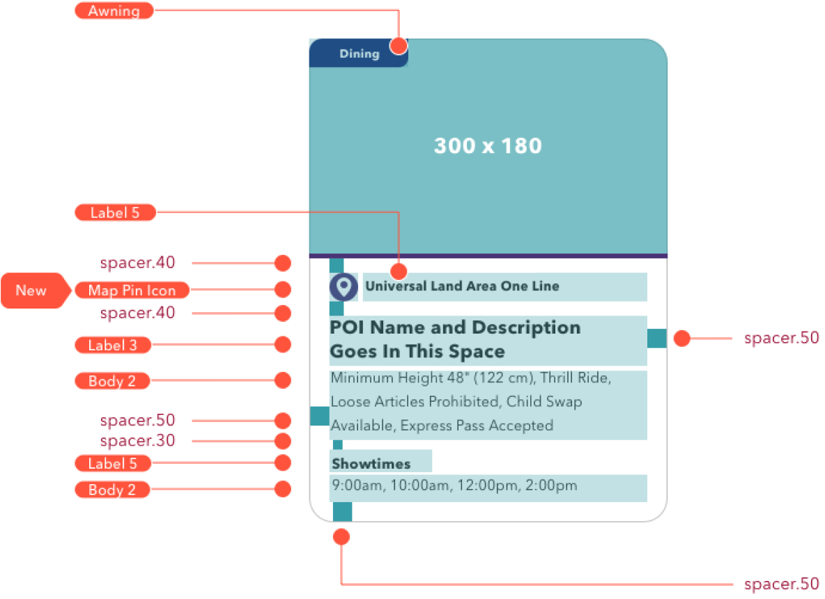
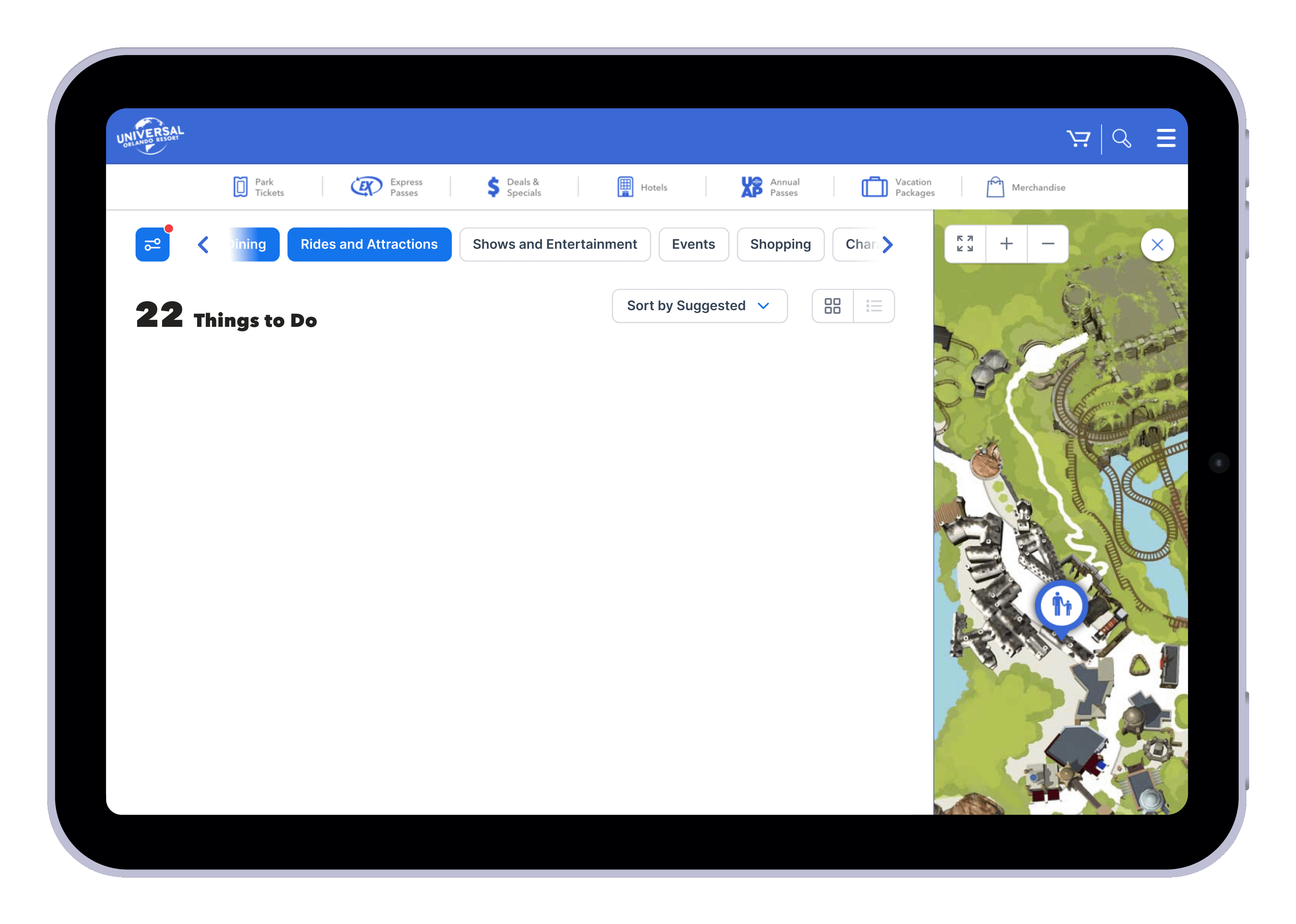
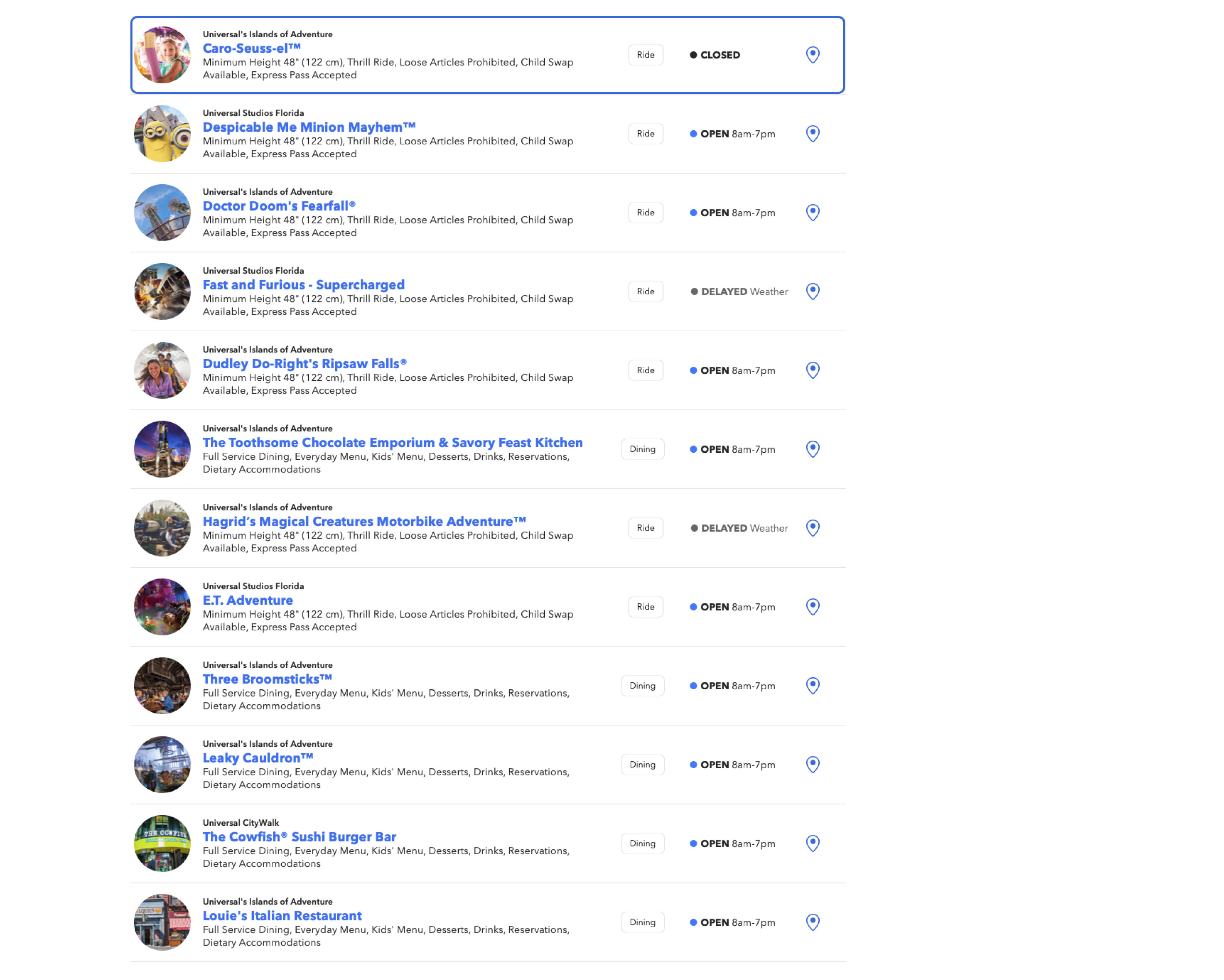
For the Universal Studios Things To Do page, I reorganized the content to prioritize activities and attractions, making them easily accessible for visitors. Recognizing that planning a visit can be a significant decision, I positioned the key highlights of the park prominently above the fold. Additionally, I showcased popular attractions alongside visitor testimonials and insider tips to enhance the perceived value of the experience. By emphasizing both the excitement of Universal Studios and the benefits of planning ahead, we make it much easier for users to click “Book Now.”
Phase 2
Refine and Define
I walked the team through my directions and we chose one to develop further. We discussed a few things to improve and figured out the next steps. We decided to make the hero less of a static image and more of a photo gallery showcase. Two days later I met with  the team again and presented the final direction. Balancing brand identity, user experience, and technical integration challenges.
Phase 2
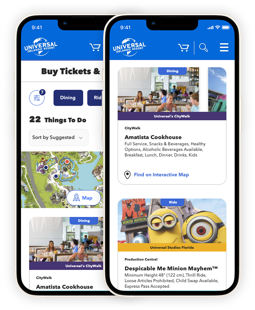
Considering The Mobile Experience
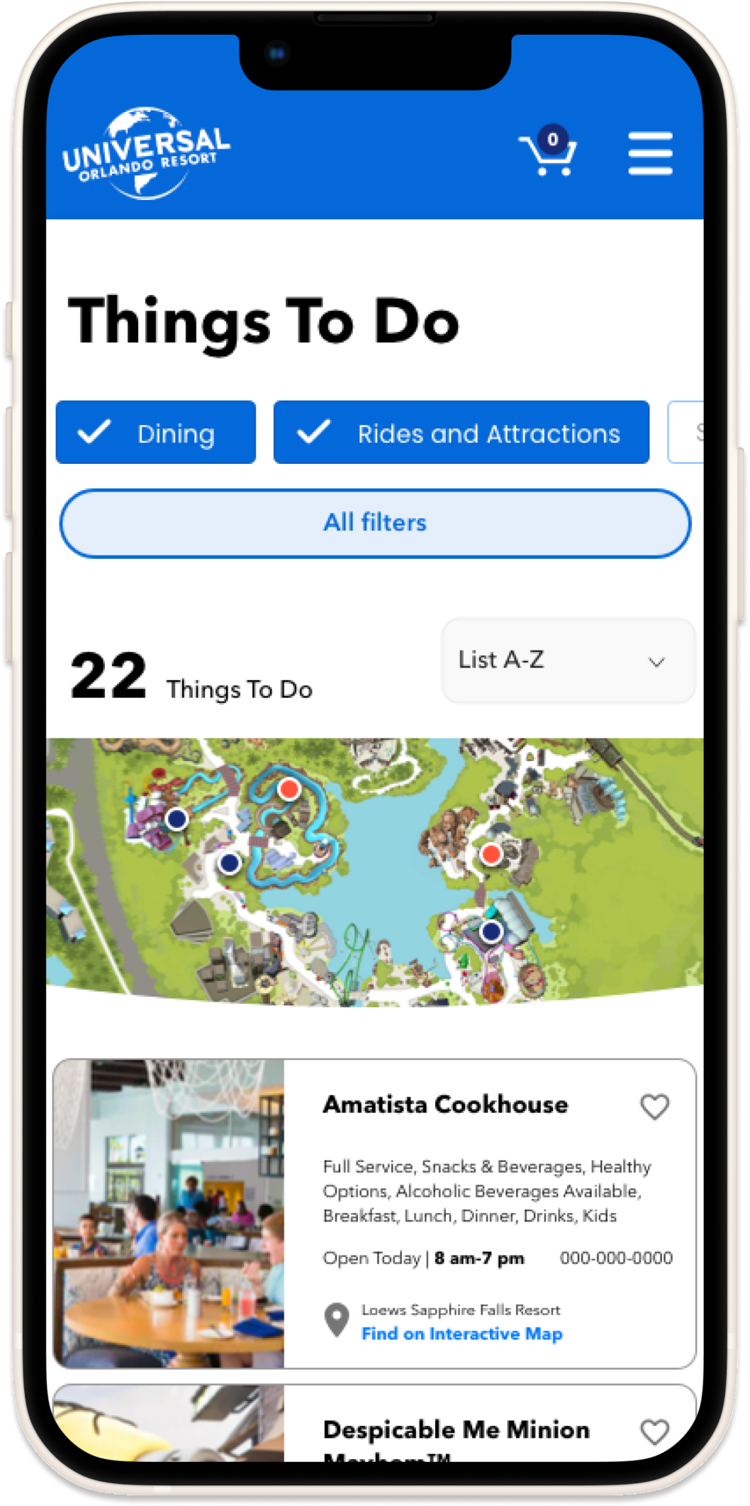
Part of phase two included flushing out all of the mobile designs and really dialing in that experience. Armed with the knowledge that most users will visit this section via their phones, my focus was to keep it as mobile-friendly as possible. I ultimately decided to keep the forms and other inputs the same on  desktop as they would be on mobile to reduce any duplication of work and keep any changes down to a minimum.
Despite all of the research and design,
the end product is always the experience.
Bonus
The Art Of The Possible
When reading through the creative brief about how the design should be a combination of results cards and map, I couldn’t help but feel the whole experience was a little lacking. The mobile experience need some help with direction the visitors to their destinations. The map was something that was going to be included in the app and we thought the site, as well. This is a design showing the map with the locations on the map and we wanted to show them in relation to where you were. Ultimately, the map was removed but I know it was a feature that would have been very welcomed.
Bonus
User Dashboard
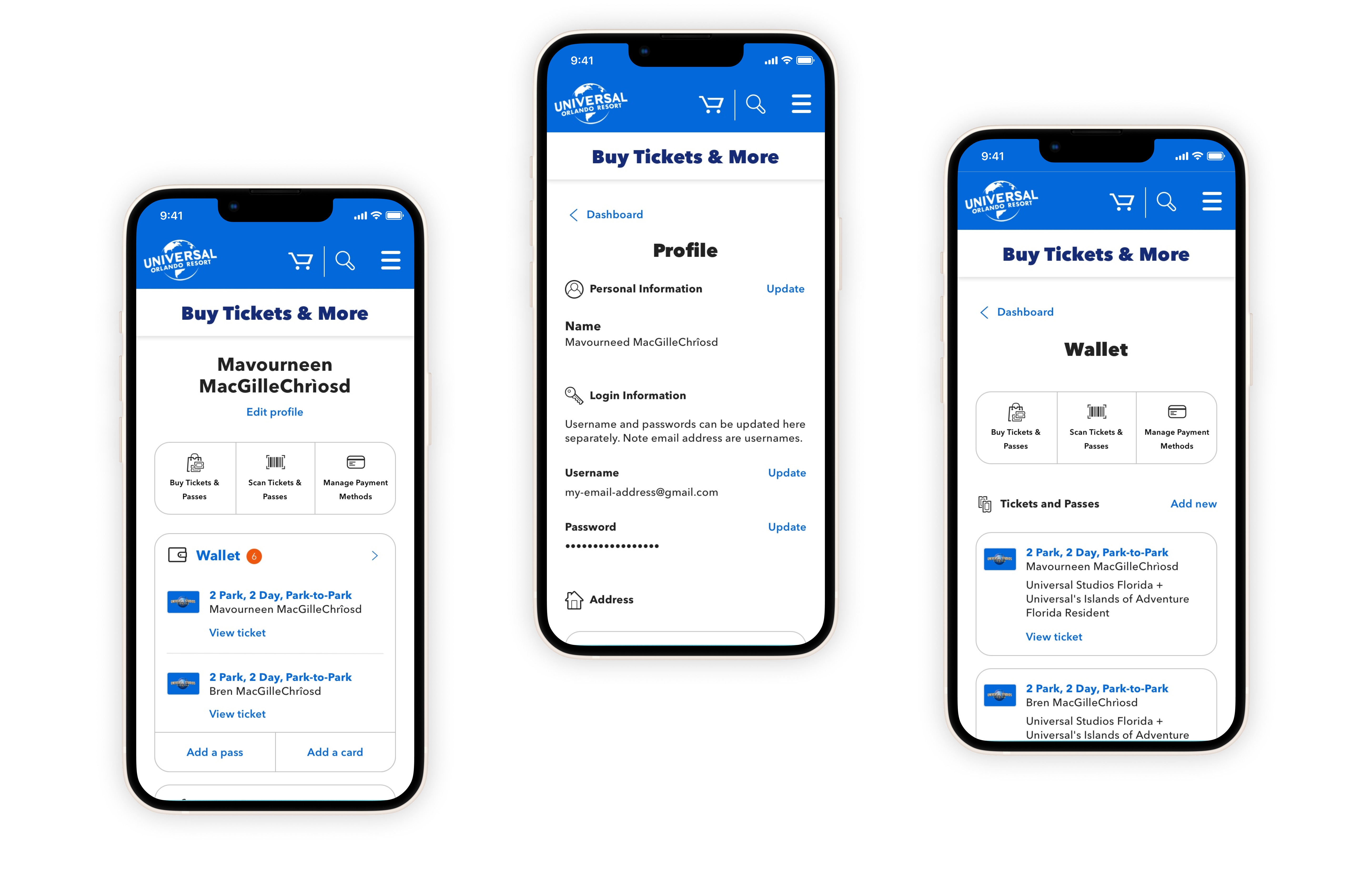
A good portion of our efforts was focused on the dashboard or user profile section. This was home to our users and their personal place within the site  that stored their billing details, tickets and passes, and other  purchased items.
Accessibility is paramount for Universal Studios and we spent a lot of time focused on screen readers and other accessibility improvements. Entire annotation documents were dedicated to ensuring  that every patron will easily be able to navigate around the sites  regardless of personal limitations.